UX Lab - A look at product variations
Many merchants sell products that come in different variations such as colour, size or flavour. Whilst these are generic and cover a multitude of items, some other products come with more specific variations that might only be applicable to them.
For example, a mobile phone might have different storage capacity such as 64GB, 128GB or 256GB, or might be available on different networks like O2, EE or Vodafone. Determining the best way of displaying product variations on both product listings and product detail pages will be key to providing a high quality user experience, and increasing sales, but which option is best? There is no right or wrong answer and what you sell, or your personal preference, may well determine your preferred solution, but let’s look at some different examples and their pros and cons.
1) Leave the default in place
The simplest solution is to class each variation of a product as a different item and reflect this in both the product listings and the product details pages. This doesn’t require any additional work in terms of setting up parent and child products, and is possibly the best solution for SEO. It also allows the user to add products to their basket directly from the product listings page, rather than having to click into the product detail page, select their variation and then add it to the basket. However, depending on the number of variations of each product, and the number of products in total, this might not deliver the best user experience as it could make items harder and more time consuming to find.
For example, KIT Online sell IT hardware and the MacBook Pros they sell come in 13 different variations based on colour, generation, screen size, and specifications. By listing them all individually, it’s difficult for the user to compare the different models from the product listings page without really studying the title and short description.
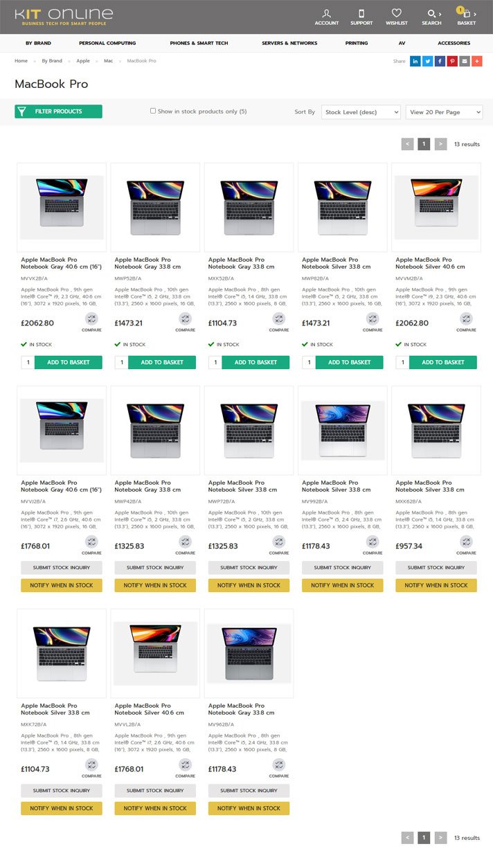
Product listings pages can become quite long, especially if there are multiple product variations to cater for.
On the Product Detail Page, the product title also becomes extremely long and difficult to read as it lists out the specifics of that variant. The user also has to go back to the product listings page if they want to select any of the other variants.
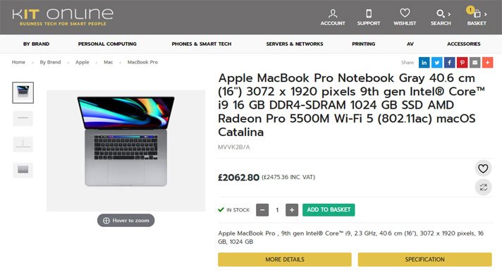
Titles on product detail pages can become very long if they written to include variation details.
2) Create a parent product to group the variants together
The second option is to create a ‘parent’ or 'dummy' product with all of the options and their variants listed as ‘children’ on it, enabling the user to select which one they want. This means that on the product listings page there is only a single item listed for a clean UX, but users can’t add items to the baskets from there. As such, pricing will be listed as ‘from £x’ too. This option requires more work to assign each child variant to a parent page, and might be slightly worse for SEO, but that is negligible. For example, The Craft Company sell numerous products that come in a multitude of different colours. Rather that list these all individually they have a parent product for each with the different colours listed as variations. In this instance all variations sit under one URL but you can also create individual URLs with a canonical tag on the variant pages back to the parent page if required.
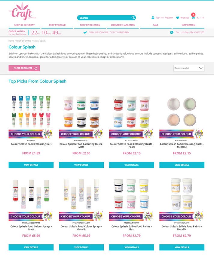
Variations are grouped together under a parent product on product listings pages.
On the product detail page, all of the variants are listed. Variants can be styled in a number of ways such as a drop down list, buttons, or stylised icons for users to select from. These might be different options of a single variant (i.e. colour) or could be different options for multiple variants (i.e. flavour and size) and are another thing to consider when thinking about the user experience. For example, a drop down list of lots of variations might not provide an easy choice for users, but there are several ways to display the options in a user-friendly fashion. The Craft Company use a small round flash of colour to signify the different variants available to their users.
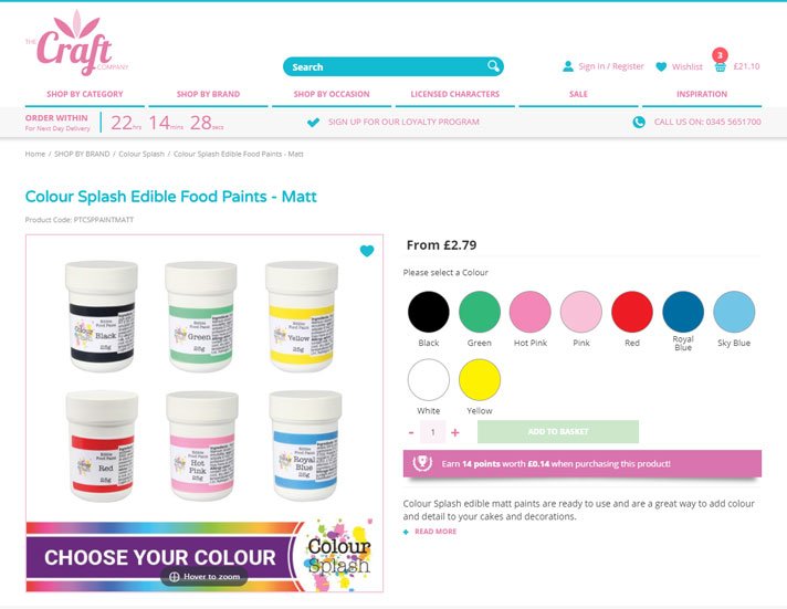
Different variations (colours in this case) of the same product are displayed on a single product detail page.
3) Introduce an add to basket pop-up
The third option is an enhancement of option 2, which means that products are still created with a parent and their relative options, and are still shown as a single item on the product listings page. However, users can now add items to the basket, including selecting multiple variations, from the product listings page through the addition of a pop-up for quicker ordering.
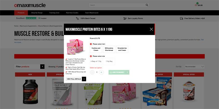
Product variations can be ordered directly from the product listings page via the pop-up.
If the customer does visit the product page, the variants are all listed on a single page, same as in option 2. In this instance Maximuscle wanted Google to index the different flavour variations, but not the different size variations, but didn't wanted the reloading of the page to a new URL each time the variant changed affecting the UX. In order to get around this the URLs of the flavours have been embedded in the page so that Google can index them but they aren't visible to the user as the page doesn't reload.
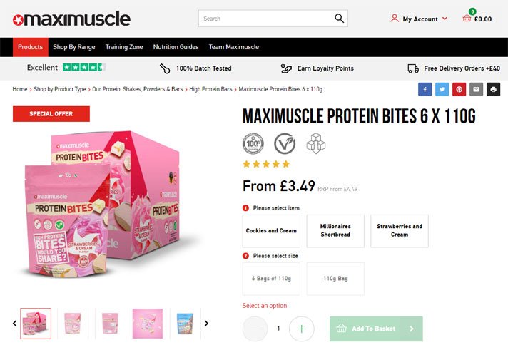
Product detail pages still contain all of the variants on a single page.
4) Alternative option (using related products)
The last option marries elements from both option 1 and 2. As per option 1, each variation is listed as a separate item on the product listings page, meaning they can be added directly to the basket (including their quantity) in order to quick buy.
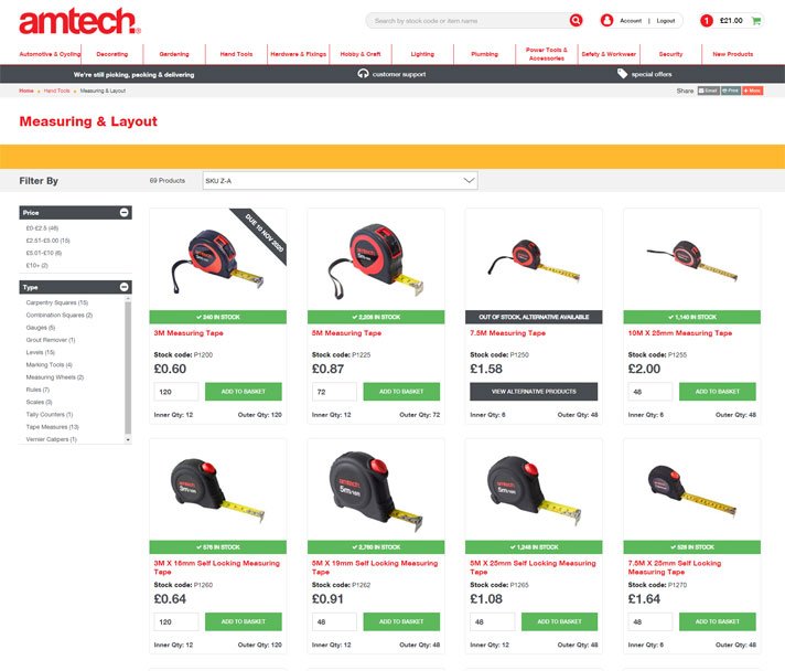
Product listings pages contain every variant separately and items can be ordered from the page.
However, when visiting any of the product pages, each of the relative variations is now listed on the subsequent page, like in option 2, rather than being split into individual product detail pages like in option 1. To help improve the UX, the product page variation that the user has clicked on will be at the top of the dropdown, or pre-selected if the merchant is using a different way of displaying the variations such as buttons or icons. The URL will also change for each variation.
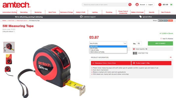
Despite variants being listed separately on the product listings page, they are still grouped on a single product detail page.
In summary
Who knew something seemingly so simple could have so many different options and consequences? Whilst there is no right and wrong way of displaying product variations, the ideal solution will most likely come down to how many products and variations of each of them you have, as well as your design & UX preferences, SEO strategy, or business type. We have some customers that use different approaches on their retail and B2B sites due to the slightly different buying habits of those two audiences for example. The flexibility of your platform and capability of your developers will also play a part in what you can achieve.
For complete flexibility on how to display your product variations talk to us about using tradeit for your ecommerce requirements, including managing product variations.