 01865 880 800
 info@redtechnology.com
Transformational Ecommerce Solutions
Learn more about our Responsive Web Design services
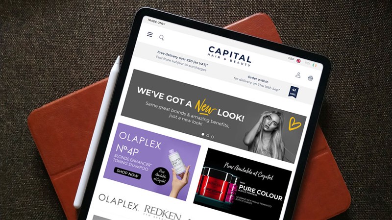
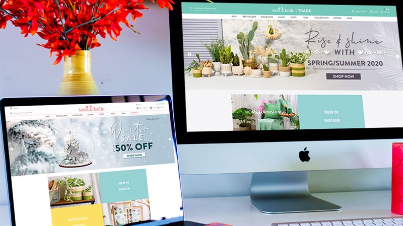
We follow a flexible design process when creating new responsive sites having developed a front-end framework, based upon bootstrap, as a base for faster and higher quality delivery of a merchant's prospective, responsive front end code. We work alongside our clients to bring their ideas to life and specialise in beautiful ecommerce designs that turn casual browsers into regular buyers. We develop sites with real people in mind meaning that user experience is at the forefront of everything we do. This means that our sites not only look great but, just as importantly, they function great too.
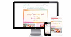
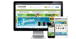
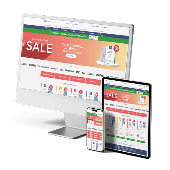
As standard, all sites are built across 4 breakpoints that depict desktop to mobile resolutions, although additional breakpoints can be delivered as part of any customer project.
The very first stage of any project is the design brief. We'll request that the client completes a questionnaire in order to understand what needs to be taken into account during the process, such as corporate guidelines, design influences and branding.
Alongside the design brief we will gather some initial assets such as logos, commercial fonts, IA/sitemap and category structure as well as example homepage content like banners, images, social media accounts and company information.
After the initial design brief and requirements gathering, we will then create hi-fidelity prototypes of the core templates (usually five) across the different breakpoints (usually four), starting with the homepage.
Following the production of the hi-fidelity prototype of core templates, low-fidelity prototypes of the remaining templates are then created.
With the hi- and lo-fidelity prototypes signed off, the HTML of the five core templates is then produced across all four breakpoints and rolled out.
Alongside the HTML rollout of the five core templates is a style guide which lays out the appearance key elements of the site such as fonts, colour references, styles, logos, buttons, links, tabs, accordions, rollovers, images etc... in a simple and easy to use document.
Using the lo-fidelity prototype as the base, and with direction from the style guide and core HTML template, the remaining HTML is produced for all of the remaining web pages and emails.
Following customer sign off of all the HTML pages and emails, the design process is now complete.